Case Study: Presto Italian Street Food – Bringing a New Restaurant Launch to Life
- Matt Stevenson
- Dec 1, 2025
- 4 min read

Working with Presto Italian Street Food has been one of the most rewarding partnerships of my career. Since their launch in 2018, I’ve had the pleasure of capturing their growth from a small high-street gazebo selling pizzas to a beloved local favourite with a thriving restaurant.
I first met Hesham, Presto’s founder, when I photographed his very first Deliveroo menu in 2018. Seven years on, we’ve become good friends and I’ve captured every part of the menu — from seasonal specials to deli items. So when he asked if I could help create temporary window signage for their brand new restaurant, due to open on 1st December 2024, I was excited to take on the project.
A year on from that opening, this case study looks back at the full process — from planning and photography to creative direction and installation.
Developing the Concept
Over the years, one feature of Presto’s brand has become unmistakable: Presto yellow. Bold, bright and instantly recognisable around town, it naturally became the core of the temporary window design.
Around a month before the new site was confirmed, Hesham mentioned that he wanted something eye-catching to build excitement while building work was underway. Although signage design isn’t one of my usual offerings, my photography, lighting and Photoshop experience meant I could confidently take this on as part of my creative direction services.
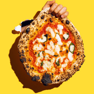
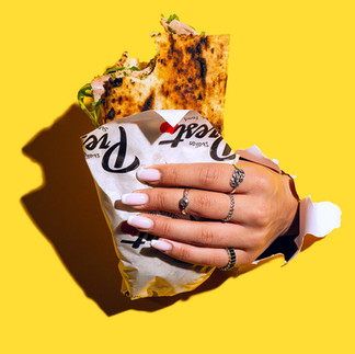
We developed the concept together. I created a mood board exploring style and visual direction. After a call with Hesham to refine some ideas, we aligned on the final vision: bright yellow windows with “torn” or “punched through” openings, revealing hands holding items representing different parts of the Presto offering.
This concept blended two things I love working on — standout food photography and brand-led storytelling.
Preparing for the Shoot
Even before final layouts were agreed, we knew the images needed to be clean, flexible and easy to reposition in the final design.
I sourced yellow cardstock that matched Presto’s brand, drafted a loose shot list and prepared my gear for a compact on-site studio.
Shoot Day: Capturing the Food Photography Elements
With limited space for a full studio setup, we built a mini one in the prep kitchen of the existing takeaway shop. This allowed fresh pizzas, coffees and other items to be prepared and shot straight away.
Before we started shooting, we visited the new site to observe how the sunlight fell across the windows. The shadows were strong and falling left — something I wanted to replicate so the final graphics would feel believable once installed.

Back in our improvised studio, I set up a yellow card backdrop and positioned a hard light source to mimic the sun. I carefully cut a tear in the card to create the breakthrough effect and fixed my camera in place.

Hands, energy and personality
Hesham made his signature Margherita pizza — simple, high-quality and perfectly executed. The shot of him holding the whole pizza instantly became a favourite.
To showcase everything Presto offers, we also photographed:
Coffee
Lunch options
Sweet treats
Italian soft drinks
A mobile phone for newsletter sign-ups
A loyal customer kindly modelled for the coffee and lunch shots, while Hesham’s wife, Yasmin, and I both stepped in for the sweet treats, drinks and phone. And, naturally, the iconic Italian 🤌 made the cut.
Throughout the shoot we also discussed the messaging and purpose behind the graphics: promoting the move, showing the full range, encouraging people to sign up for updates and attracting potential new team members.
Editing & Designing the Window Graphics
Once back at my desk, I imported, reviewed and narrowed down the best images. Each was cut out carefully so they could be placed cleanly on a bright yellow background during layout.
First Draft:


The first draft included everything on the main front window and one side panel. Hesham’s feedback was to make it cleaner and less busy, so we expanded the concept to five separate windows with bold, larger graphics that could be seen from the roadside.
Precision layout & problem solving
When the final measurements came in, the biggest challenge was the double front doors. I mapped out the joins and gaps directly in Photoshop to ensure the main logo wouldn’t be split awkwardly across hinges or frames.
Door measurements received:


Final Design:


Thanks to that planning, the sign writers were able to install everything perfectly.
Installation Day
Seeing the graphics go up in was a brilliant moment. Even though they were temporary during building works, having my images blown up at that scale was incredibly rewarding — especially watching people stop and smile as they walked past.

One unexpected bonus was that the graphics allowed people inside to see out, but prevented passers-by from seeing in. This meant the team could discreetly watch reactions from inside, and the curiosity and excitement confirmed the signage had done exactly what it needed to.

One Year Later (1st December 2025)
With the restaurant now having been open for a full year, it’s amazing to look back on how this project helped build anticipation and tell Presto’s story in a fun, recognisable way.
Presto celebrated their 7th birthday on 1st December 2025, and it’s been a joy to see how far they’ve come — from a part-time market stall to a buzzing restaurant serving breakfast, lunch and dinner with a loyal and ever-growing customer base.
I’m proud to have played a part in their journey, both creatively and photographically.
Planning a new opening or looking to elevate your food brand?
I can support you with:
Food photography
Brand-led imagery
Creative direction
Campaign assets and bespoke graphics
If you’re preparing for a launch or looking for standout imagery for your next phase of growth, I’d love to hear about your plans.

That’s a really cool way to look at food photography. I’ve been trying to get better at styling my shots, and this gave me a few ideas to try with natural light. I actually found some helpful tips on Bizarre Lineage Wiki that go into more detail about composition.
Really interesting take on bringing a restaurant launch to life—those early marketing decisions can make or break the momentum. I actually dug into the lore and world-building around Neverness to Everness Wiki recently, and it reminded me how important a strong backstory is for any brand experience. Makes me wonder if Presto leaned into any narrative elements like that for their launch.
Really enjoyed this post—the way you broke down lighting angles for food shots made it click for me. I've been experimenting with side lighting lately, and ScopeQuill helped me get a better handle on the setup.
This chat widget setup looks really polished, and I love how seamless the whole Wix integration feels. I’ve been testing SubtitleOps for managing subscriber conversations, and it’s been a huge time-saver compared to juggling multiple chat windows manually.
I went through "Case Study: Presto Italian Street Food – Bringing a New Restaurant Launch to Life" just now, and I liked how clear and grounded the writing felt. I will revisit this post again. refresh rate checker