Colour Theory in Food Photography: Case Study From a Recent Restaurant Shoot
- Matt Stevenson
- Jun 30, 2025
- 4 min read


We talk a lot about lighting, plating, and styling in food photography but one of the most overlooked (yet powerful) elements is colour.
Colour affects everything: how the food feels, how appetising it looks, and where the viewer’s eye is drawn. It’s not just about what’s on the plate, but everything around it too - walls, table settings, props, and even the plates themselves.

Why Colour Theory Matters
Understanding basic colour theory helps you create stronger, more intentional images:
Complementary colours (opposites on the colour wheel) create high contrast and visual energy. For example, a rich tomato sauce (red) can pop beautifully on a green-hued plate.
Analogous colours (those close together on the wheel) create a sense of harmony and flow - think a plate of golden roasted vegetables with warm wooden boards and beige napkins.
Neutral tones (black, grey, white, beige) are your secret weapon. They let the food do all the talking.
These principles are especially important in restaurant photography, where the décor and brand colours can either enhance your food or distract from it completely.

Case Study: The Orange Wall Cladding Dilemma
I recently worked with a restaurant where the main dining room was beautifully designed, but the walls had 3 stripes of strong orange-ton
ed wood panelling. Visually, it worked great for diners - but in photos, it created a colour clash with the menu items.
The warm orange tones of the wood took attention away from what was supposed to be the hero of the image - the food. Although this could have been toned down in the edit, we wanted to capture as many dishes as possible and this additional editing requirement would have severely reduced the number of items we would have been able to shoot.
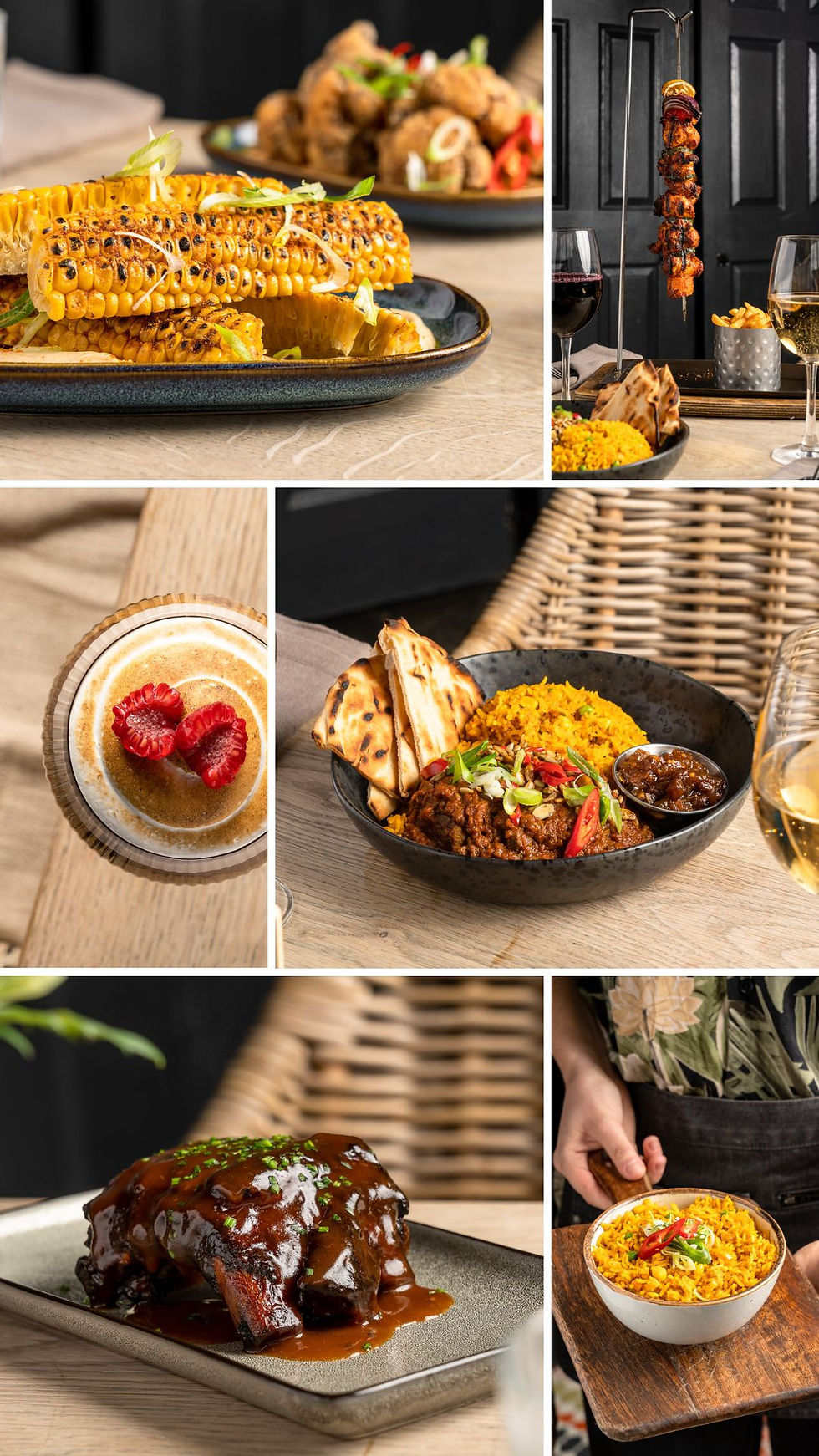
So we made a quick decision: we moved the shoot to the back room.


It had a completely different feel at first glance, but by bringing in the restaurant’s tables, chairs, and styling elements, we recreated a mini dining scene. The room had a more subtle black wall that gave us a neutral backdrop. Suddenly, the food was the hero again - and the restaurant’s essence was still present in the props and setup.
The final result was a gallery of images with the look and feel of the restaurant minus any overpowering background colours detracting from the beautiful food on display.
Tips for Applying Colour Theory to Restaurant Shoots
Whether you're working with a photographer or snapping images in-house, here are some actionable tips to improve your results:
Scout the location with your eyes and the colour wheel - What looks beautiful in person might not translate well in a photo. Warm woods, dark reds, and patterned wallpaper can all reflect colour casts onto your food. Ask: Is this helping the food stand out, or pulling focus from it?
Don’t be afraid to move the shoot - If the main dining area isn’t working, set up elsewhere. Even a service corridor can become the perfect photo spot with the right props and styling. What matters is what’s in the frame, not what’s outside it.
Choose your plates wisely - Bright white plates are classic, but don’t underestimate the power of matte blacks, soft greys, or even muted earthy tones. Think about what colours are in the food, and how the plate can support them.
Add pops of colour with intention - Fresh herbs, edible flowers, napkins, or drinks can be used to create complementary contrast. For example, a golden cocktail can enhance the warmth of a sunset-toned dish, or a sprig of green adds a cooling counterpoint to a spicy red curry.
Use brand colours subtly - If your restaurant’s branding uses bold colours (say teal or mustard), consider incorporating them into props - napkins, backgrounds, or cutlery - rather than flooding the whole image. It keeps the visuals consistent while still letting the food shine.
Think like a painter when editing - Post-production is where colour theory can really come alive. Subtle shifts in warmth, saturation, and contrast can bring your image together. But the more you get right on set, the less you'll need to fix in editing.
Keep neutrals in your toolkit - Black, white, and natural tones are your fallback. If a colourful background is clashing or distracting, don’t hesitate to go simple. A clean black or grey wall can be a lifesaver in busy restaurant interiors.
Final Bite
Every restaurant has its own story, style, and palette - but colour can either support that narrative or get in the way. A good food photo doesn’t just show what’s on the plate - it communicates the vibe of your space, the mood of your menu, and the essence of your brand.
So next time you’re planning a shoot, take a moment to consider your colours. It could be the difference between a nice photo and a photo that makes people book a table.
Until next time - shoot smart, style with purpose, and trust your eye.
Matt

I just finished reading "Colour Theory in Food Photography: Case Study From a Recent Restaurant Shoot", and the structure made the key ideas easy to follow. It also connects nicely with Test microphone input and check recording responsiveness in browser.. Thanks for sharing this. online mic test